

Geographic Inflation
The vast majority of us aren’t using paper maps to chart our course across the ocean anymore, so critics of the Mercator projection argue that the continued use of this style of map gives users a warped sense of the true size of countries—particularly in the case of the African continent.
Mercator’s map inadvertently also pumps up the sizes of Europe and North America. Visually speaking, Canada and Russia appear to take up approximately 25% of the Earth’s surface, when in reality they occupy a mere 5%.
As the animated GIF below—created by Reddit user, neilrkaye – demonstrates, northern nations such as Canada and Russia have been artificially “pumped up” in the minds of many people around the world.
Source: Visual Capitalist
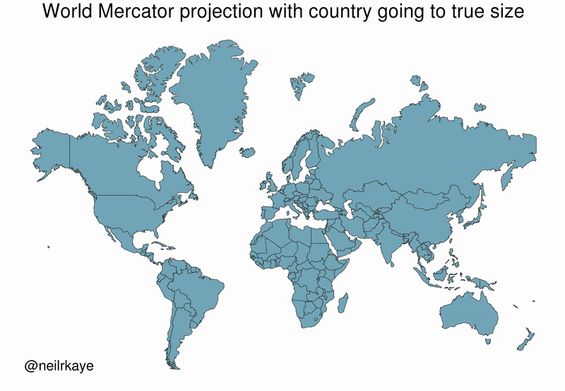
In reaction to Canada’s true geographical size being brought to light, PM Trudeau called an election hoping the citizens will not notice the Great Dominion’s geographical diminution in the eyes of the world, counting on the distraction over why a federal election was called in the first place.
anonymous

